It is aimed at visualizing relationships in (psychometric) data as networks to create a clear picture of what the data actually looks like.
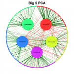
Its main use is to visualize correlation matrices as a network in which each node represents a variable and each edge a correlation. The color of the edges indicate the sign of the correlation (green for positive correlations and red for negative correlations) and the width indicate the strength of the correlation. Other statistics can also be used in the graph as long as negative and positive values are comparable in strength and zero indicates no relationship.
qgraph also comes with various functions to visualize other statistics and even perform analyses, such as EFA, PCA, CFA and SEM. The stable release of qgraph is available at CRAN, the developmental version of qgraph is available at GitHub and finally an article introducing the package in detail is available in the Journal of Statistical Software.
http://sachaepskamp.com/qgraph
没有评论:
发表评论